Let's Connect :)
Copyright © All rights reserved.

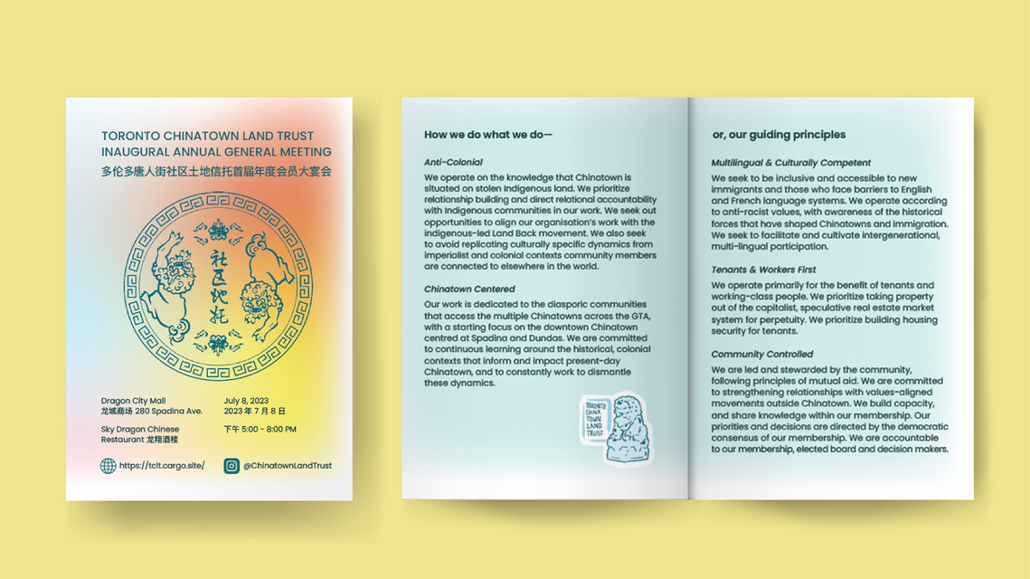
Toronto Chinatown Land Trust
This logo for the Toronto Chinatown Land Trust (TCLT) takes inspiration from the longevity pattern found on ceramic bowls, and the protection of Chinese guardian lions (fu dogs). The mission of the organization is to be a community-controlled effort to build an inclusive, culturally competent, and ever evolving Chinatown in Toronto. With this in mind, we wanted to create an identity that is warm, welcoming and trustworthy, while still feeling young and energetic, and being specific to the community.


Process Work:
The design concept we chose was inspired by the longevity pattern commonly used on Chinese ceramics. It’s also a nod to the Dish with One Spoon Treaty that we must all operate under, especially when dealing with land. The Chinese guardian statue and the raccoon were motifs which also resonated with us, and ended up coming into the brand in different ways.

At this stage we simplified to logo, so it would be adaptable to smaller sizes (i.e. social media icon). We focused on the pattern itself rather than representing the whole dish, and we re-integrated the guardian lions into the logo.
